Home
Categories
Dictionary
Glossary
Download
Project Details
Changes Log
What Links Here
FAQ
License
List of XUL controls
1 General attributes
1.1 General elements attributes
1.2 Style elements attributes
1.3 Interactive elements attributes
1.4 Sized elements attributes
2 Containers
2.1 window
2.2 stack
2.3 vbox
2.4 hbox
2.5 bbox
2.6 box
2.7 groupbox
2.8 radiogroup
2.9 tabbox
2.10 tabpanel
2.11 menubar
2.12 toolbox
2.13 toolbar
2.14 toolbaritem
2.15 menu
2.16 menulist
3 Controls
3.1 label
3.2 button
3.3 toolbarbutton
3.4 checkbox
3.5 radio
3.6 textbox
3.7 progressmeter
3.8 listbox
3.9 tree
3.10 scale
3.11 scrollbar
3.12 image
3.13 filefield
3.14 tab
3.15 menuitem
3.16 menuseparator
4 Utility elements
4.1 spacer
4.2 toolbarspacer
4.3 caption
5 Notes
6 See also
This article presents the list of XUL controls.
The following attributes are available for all elements which have a graphic representation:
The possible attributes are:
Another example with the usage of "onload"
The possible attributes are:
Example:
The possible attributes are:
The possible attributes are:
The possible attributes are:
The possible attributes are:
Example:
The possible attributes are:
The possible attributes are:
The possible attributes are:
Example:
The
Example:
The
Example:
The
The possible attributes are:
Example:
The
The possible attributes are:
The possible attributes are:
Example:
The possible attributes are:
The possible attributes are:
The possible attributes are:
The possible attributes are:
The possible attributes are:
The possible attributes are:
Example for a number editor:
The possible attributes are:
The
The listbox has several children elements:
The
The listbox has several children elements:
The possible attributes are:
The possible attributes are:
The possible attributes are:
Example:
The possible attributes are:
Note that this element must be under a
Example:
The possible attributes are:
Note that this element must be under a
Example:
The possible attributes are:
The possible attributes are:
The possible attributes are:
General attributes
General elements attributes
The following attributes are available for all elements:-
id: the id of the element -
hidden: true if the element is hidden -
onmouseoverfor mouse over events on XUL widgets -
onmouseoutfor mouse exit events on XUL widgets
Style elements attributes
Main Article: Styling XUL widgets
The following attributes are available for all elements which have a graphic representation:
-
class: the CSS style class of the element -
style: the CSS style of the element
Interactive elements attributes
The following attributes are also available for all interactive elements:-
disabled: true if the element is disabled -
oncommand: the Javascript function to execute if the user execute an action on the element
-
oncommandfor command events on XUK widgets. Note that these events correspond to events sent by widget after the end of a change. Cntrary to theonchangeevents, events sent before the end of a continuous change (such as the moving of a scale won't be sent -
onclickfor click events on XUL widgets. It will have the same result that "oncommand", for widgets which have click events (such as button) -
onchangefor change events on XUL widgets. In this case, events sent before the end of a continuous change will be sent -
onselectfor selection events on XUL widgets
Sized elements attributes
The following attributes are also available for elements which have a size:-
width: the element width -
height: the element height -
top: the element position from its parent top corner. Only used if the parent is a stack element -
left: the element position from its parent left corner. Only used if the parent is a stack element
Containers
window
Thewindow element describes the top-level window. It must be the root of the XUL file.The possible attributes are:
-
id: the id of the element -
hidden: true if the element is hidden -
title: the title of the window -
width: the width of the window -
height: the height of the window -
screenX: the X position of the window in the screen -
screenY: the Y position of the window in the screen -
resizable: false if the window can't be resized[1]This attribute did not exist in the original XUL specification because the XUL tree was always shown in the browser which could always be resized -
orient: the orientation of the window. Can be "horizontal" (the default) or "vertical" -
onloadsent for the window when the framework is started
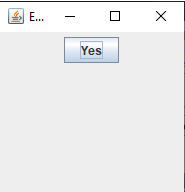
      <window id="Test" title="Test XULScripts" orient="horizontal"
      xmlns="http://www.mozilla.org/keymaster/gatekeeper/there.is.only.xul">
         <button label="Yes"/>
      </window>
The result is:
Another example with the usage of "onload"
      <window id="Test" title="Test XULScripts" orient="horizontal" onload="loaded()"
      xmlns="http://www.mozilla.org/keymaster/gatekeeper/there.is.only.xul">
      <script>
      function loaded() {
      document.getElementById("theButton").label = "No";
      }
      </script>
         <button id="theButton" label="Yes"/>
      </window>
stack
Thestack element displays interface controls at specified positions.The possible attributes are:
-
id: the id of the element -
hidden: true if the element is hidden -
top: the element position from its parent top corner. Only used if the parent is astackelement -
left: the element position from its parent left corner. Only used if the parent is astackelement -
class: the CSS style class of the element -
style: the CSS style of the element
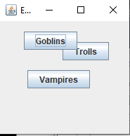
top and left attributes.Example:
      <stack>
         <button label="Goblins" left="5" top="5"/>
         <button label="Trolls" left="60" top="20"/>
         <button label="Vampires" left="10" top="60"/>
      </stack>
The result is:
vbox
Thevbox element is used to align interface controls vertically.The possible attributes are:
-
id: the id of the element -
hidden: true if the element is hidden -
height: the height of the box -
top: the element position from its parent top corner. Only used if the parent is astackelement -
left: the element position from its parent left corner. Only used if the parent is astackelement -
class: the CSS style class of the element -
style: the CSS style of the element
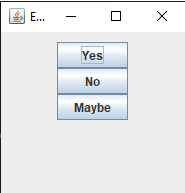
      <vbox>
        <button label="Yes"/>
        <button label="No"/>
        <button label="Maybe"/>
      </vbox>
The result is:
hbox
Thehbox element is used to align interface controls horizontally.The possible attributes are:
-
id: the id of the element -
hidden: true if the element is hidden -
width: the width of the box -
top: the element position from its parent top corner. Only used if the parent is astackelement -
left: the element position from its parent left corner. Only used if the parent is astackelement -
class: the CSS style class of the element -
style: the CSS style of the element
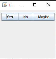
      <hbox>
        <button label="Yes"/>
        <button label="No"/>
        <button label="Maybe"/>
      </hbox>
The result is:
bbox
Thebbox element is identical as hbox . It is used to align interface controls horizontally.
box
Thebox element is used to align interface controls horizontally or vertically. It works as the vbox or hbox elements.The possible attributes are:
-
orient: the orientation of the box. Can be "horizontal" (the default) or "vertical" -
id: the id of the element -
hidden: true if the element is hidden -
width: the width of the box for horizontal boxes -
height: the height of the box for vertical boxes -
top: the element position from its parent top corner. Only used if the parent is astackelement -
left: the element position from its parent left corner. Only used if the parent is astackelement -
class: the CSS style class of the element -
style: the CSS style of the element
      <box orient="vertical">
        <button label="Yes"/>
        <button label="No"/>
        <button label="Maybe"/>
      </box>
The result is:
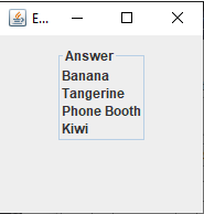
groupbox
Thegroupbox element is used to group a labelled box around other user interface controls.The possible attributes are:
-
id: the id of the element -
hidden: true if the element is hidden -
top: the element position from its parent top corner. Only used if the parent is astackelement -
left: the element position from its parent left corner. Only used if the parent is astackelement -
class: the CSS style class of the element -
style: the CSS style of the element
Example:
      <groupbox>
         <caption label="Answer"/>
         <description value="Banana"/>
         <description value="Tangerine"/>
         <description value="Phone Booth"/>
         <description value="Kiwi"/>
      </groupbox>
The result is:
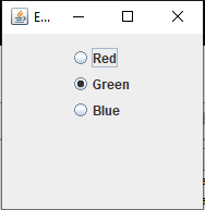
radiogroup
Theradiogroup element is used to group a list of radio buttons, only one being selected at a time.The possible attributes are:
-
id: the id of the element -
hidden: true if the element is hidden -
top: the element position from its parent top corner. Only used if the parent is astackelement -
left: the element position from its parent left corner. Only used if the parent is astackelement
      <radiogroup>
         <radio id="orange" label="Red"/>
         <radio id="violet" label="Green" selected="true"/>
         <radio id="yellow" label="Blue"/>
      </radiogroup>
The result is:
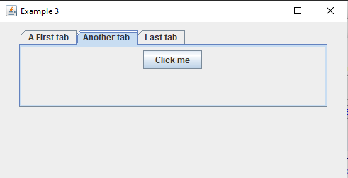
tabbox
Thetabbox element is used to display a tabbed pane.The possible attributes are:
-
selectedIndex: the index of the selected tab (by default, it will be the first one). Remark that the first one has the index 1 and not 0 -
id: the id of the element -
hidden: true if the element is hidden -
top: the element position from its parent top corner. Only used if the parent is astackelement -
left: the element position from its parent left corner. Only used if the parent is astackelement -
oncommand: the Javascript function to execute if the user select a tab -
onchange: the Javascript function to execute if the user select a tab
- One
tabchild for each tab, describing the label and/or icon of the tab - One
tabpanelchild for each tab, describing the content under the tab
      <tabbox id="myTabList" selectedIndex="2">
         <tabs>
            <tab label="A First tab"/>
            <tab label="Another tab"/>
            <tab label="Last tab"/>
         </tabs>
         <tabpanels>
            <tabpanel>
               <radiogroup>
                  <radio id="orange" label="Red"/>
                  <radio id="violet" label="Green" selected="true"/>
                  <radio id="yellow" label="Blue"/>
               </radiogroup>
            </tabpanel>
            <tabpanel>
               <button label="Click me"/>
            </tabpanel>
            <tabpanel>
               <hbox>
                  <groupbox orient="vertical">
                     <caption label="battery 1" />
                     <scale id="bat1" max="100" min="0" width="200" value="20" tooltiptext="scale"/>
                  </groupbox>
               </hbox>
            </tabpanel>
         </tabpanels>
      </tabbox>
The result is:
tabpanel
Thetabpanel element specifies the component under a tab for the tabbox element.The possible attributes are:
-
class: the CSS style class of the element -
style: the CSS style of the element
tabpanels element. it correspond to the associated tab element for the tabbox.Example:
      <tabbox id="myTabList" selectedIndex="2">
         <tabs>
            <tab label="A First tab"/>
            <tab label="Another tab"/>
            <tab label="Last tab"/>
         </tabs>
         <tabpanels>
            <tabpanel>
      ...
            </tabpanel>
            <tabpanel>
      ...
            </tabpanel>
            <tabpanel>
      ...
            </tabpanel>
         </tabpanels>
      </tabbox>
menubar
Main Article: XUL menus
The
menubar element is used to declare the menus which will be presented at the top of the window. This element must have menu element children. Example:
    <window id="Test" title="My Window" orient="horizontal"
      xmlns="http://www.mozilla.org/keymaster/gatekeeper/there.is.only.xul">
      <menubar>
        <menu>
      ...
        </menu>
      </menubar>
   </window>
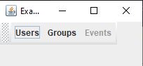
toolbox
Main Article: XUL toolbars
The
toolbox is an empty container containing toolbars. It has no attributes.Example:
    <window id="Test" title="My Window" orient="horizontal"
      xmlns="http://www.mozilla.org/keymaster/gatekeeper/there.is.only.xul">
      <toolbox>
        <toolbar id="nav-toolbar">
          <toolbarbutton id="nav-users"  label="Users"/>
          <toolbarbutton id="nav-groups" label="Groups"/>
          <toolbarbutton id="nav-events" label="Events" disabled="true"/>
        </toolbar>
      </toolbox>
   </window>
toolbar
Main Article: XUL toolbars
The
toolbar element describes a toolbar. This element must be under a toolbox element. The possible attributes are:
-
id: the id of the element
    <window id="Test" title="My Window" orient="horizontal"
      xmlns="http://www.mozilla.org/keymaster/gatekeeper/there.is.only.xul">
      <toolbox>
        <toolbar id="nav-toolbar">
          <toolbarbutton id="nav-users"  label="Users"/>
          <toolbarbutton id="nav-groups" label="Groups"/>
          <toolbarbutton id="nav-events" label="Events" disabled="true"/>
        </toolbar>
      </toolbox>
   </window>
The result is:
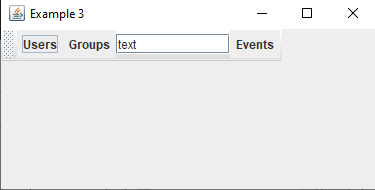
toolbaritem
Thetoolbaritem is a wrapper element which must be used on a toolbar to wrap elements different from toolbarbutton. Example:
    <window id="Test" title="My Window" orient="horizontal"
      xmlns="http://www.mozilla.org/keymaster/gatekeeper/there.is.only.xul">
      <toolbox>
        <toolbar id="nav-toolbar">
          <toolbarbutton id="nav-users"  label="Users"/>
          <toolbaritem>
            <textbox value="The text" cols="10"/>
          </toolbaritem>
          <toolbarbutton id="nav-events" label="Events"/>
        </toolbar>
      </toolbox>
   </window>
The result is:
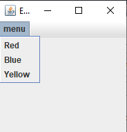
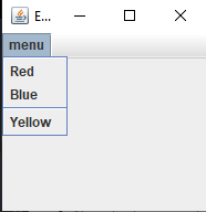
menu
Main Article: XUL menus
The
menu element displays a menu at the top of the window.The possible attributes are:
-
id: the id of the element -
label: the label of the menu -
disabled: true if the element is disabled
- Be under a menubar element
- Have a
menupopupelement child. The items of the menu will be under this element
    <menubar>
      <menu label="Colors">
         <menupopup>
            <menuitem label="Red"/>
            <menuitem label="Blue"/>
            <menuitem label="Yellow"/>
         </menupopup>
      </menu>
    </menubar>
The result is:
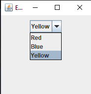
menulist
Themenulist element displays a combobox.The possible attributes are:
-
id: the id of the element -
disabled: true if the element is disabled -
hidden: true if the element is hidden
menupopup element child. The items of the menu will be under this element.Example:
      <menulist>
         <menupopup>
            <menuitem label="Red"/>
            <menuitem label="Blue"/>
            <menuitem label="Yellow" selected="true"/>
         </lt;menulist>
      </menu>
The result is:
Controls
label
Thelabel element describes a label.The possible attributes are:
-
id: the id of the element -
hidden: true if the element is hidden -
value: the text of the label -
top: the element position from its parent top corner. Only used if the parent is astackelement -
left: the element position from its parent left corner. Only used if the parent is astackelement -
class: the CSS style class of the element -
style: the CSS style of the element -
onmouseoverfor mouse over events -
onmouseoutfor mouse exit events
<label id="mylabel" value="This is some text"/>
button
Thebutton element describes a button.The possible attributes are:
-
id: the id of the element -
hidden: true if the element is hidden -
checked: true if the button is checked -
disabled: true if the element is disabled -
image: the image to use with the button -
label: the text of the button -
type: the type of the button. If the attribute is not present, the button will be a normal button. The other possible values are: -
checkbox: for a toggle button[2]Note that in this case it has two states like a checkbox but looks like a toggle button -
radio: for a radio button -
menu: for a menu button -
top: the element position from its parent top corner. Only used if the parent is astackelement -
left: the element position from its parent left corner. Only used if the parent is astackelement -
width: the element width -
height: the element height -
class: the CSS style class of the element -
style: the CSS style of the element -
oncommand: the Javascript function to execute if the user click on the button -
onclick: the Javascript function to execute if the user click on the button -
onmouseoverfor mouse over events -
onmouseoutfor mouse exit events
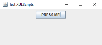
<button label="PRESS ME!" oncommand="buttonPressed()" />The result is:
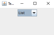
      <button type="menu" oncommand="selected" >
         <menupopup>
            <menuitem label="List"/>
            <menuitem label="Details"/>
         </menupopup>
      </button>
The result is:
toolbarbutton
Thetoolbarbutton element describes a button in a toolbar.The possible attributes are:
-
id: the id of the element -
hidden: true if the element is hidden -
checked: true if the button is checked -
disabled: true if the element is disabled -
image: the image to use with the button -
label: the text of the button -
width: the element width -
height: the element height -
class: the CSS style class of the element -
style: the CSS style of the element -
oncommand: the Javascript function to execute if the user click on the button -
onmouseoverfor mouse over events -
onmouseoutfor mouse exit events
      <toolbar id="nav-toolbar">
         <toolbarbutton id="nav-users"  label="Users"/>
         <toolbarbutton id="nav-groups" label="Groups"/>
         <toolbarbutton id="nav-events" label="Events" disabled="true"/>
      </toolbar>
The result is:
checkbox
Thecheckbox element describes a checkbox.The possible attributes are:
-
id: the id of the element -
hidden: true if the element is hidden -
checked: true if the checkbox is checked -
disabled: true if the element is disabled -
image: the image to use with the checkbox -
label: the text of the checkbox -
top: the element position from its parent top corner. Only used if the parent is astackelement -
left: the element position from its parent left corner. Only used if the parent is astackelement -
class: the CSS style class of the element -
style: the CSS style of the element -
oncommand: the Javascript function to execute if the user click on the checkbox -
onclick: the Javascript function to execute if the user click on the checkbox -
onmouseoverfor mouse over events -
onmouseoutfor mouse exit events
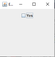
<checkbox label="Yes" oncommand="buttonPressed()" />The result is:
radio
Theradio element describes a radio button.The possible attributes are:
-
id: the id of the element -
hidden: true if the element is hidden -
selected: true if the checkbox is selected -
disabled: true if the element is disabled -
image: the image to use with the radio button -
label: the text of the radio button -
top: the element position from its parent top corner. Only used if the parent is astackelement -
left: the element position from its parent left corner. Only used if the parent is astackelement -
class: the CSS style class of the element -
style: the CSS style of the element -
oncommand: the Javascript function to execute if the user click on the radio button -
onmouseoverfor mouse over events -
onmouseoutfor mouse exit events
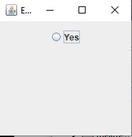
<radio label="Yes" oncommand="buttonPressed()" />The result is:
textbox
Thetextbox element describes an editable textbox.The possible attributes are:
-
id: the id of the element -
hidden: true if the element is hidden -
disabled: true if the element is disabled -
value: the text of the texbox -
rows: the number of rows of text (default is one row) -
cols: the number of columns of text (default is 20) -
multiline: true for a multiline text -
wrap: true for a wrapped text for multiline text -
type: the type of the textbox. The following values are supported: - "text" (the default): for a text editor
- "number" : for a number editor
-
min: the minimum value for a number editor (the default is 0) -
max: the maximum value for a number editor (the default is 100) -
increment: the increment step value for a number editor (the default is 1) -
top: the element position from its parent top corner. Only used if the parent is astackelement -
left: the element position from its parent left corner. Only used if the parent is astackelement -
class: the CSS style class of the element -
style: the CSS style of the element -
oncommand: the Javascript function to execute if the user change the value -
onchange: the Javascript function to execute if the user change the value -
onmouseoverfor mouse over events -
onmouseoutfor mouse exit events
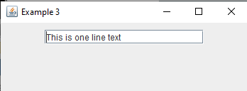
<textbox value="This is a one line text" cols="20"/>The result is:
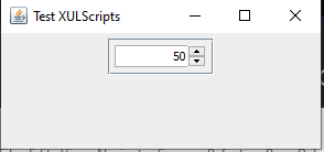
Example for a number editor:
<textbox type="number" value="50" min="0" max="100" increment="1" cols="10"/>The result is:
progressmeter
Theprogressmeter element describes a progress bar.The possible attributes are:
-
id: the id of the element -
hidden: true if the element is hidden -
value: the current value for the progress bar (should be between 0 and max, default is 0) -
max: the maximum value for the progress bar (default is 100) -
mode: the mode of the progress bar. Can have one of the follwing values: - "determinate": a determinate progress bar (showing the current value). This is the default mode
- "indeterminate": an indeterminate progress bar (not showing the current value)
-
top: the element position from its parent top corner. Only used if the parent is astackelement -
left: the element position from its parent left corner. Only used if the parent is astackelement -
width: the element width -
height: the element height -
class: the CSS style class of the element -
style: the CSS style of the element -
onmouseoverfor mouse over events -
onmouseoutfor mouse exit events
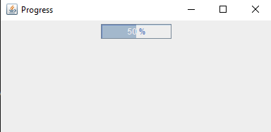
<progressmeter width="100" value="50" />The result is:
listbox
Main Article: XUL listbox
The
listbox element describes a list or table with one or more columns.The listbox has several children elements:
- The
listheadelement describes the header of alistbox - The
listheaderelementone columns definition in the header of alistbox - The
listitemelement describes one item in alistbox - The
listcellelement describes one cell in an item for a multicolumnlistbox
-
id: the id of the element -
hidden: true if the element is hidden -
disabled: true if the element is disabled -
selectedIndex: the index of the currently selected row -
top: the element position from its parent top corner. Only used if the parent is astackelement -
left: the element position from its parent left corner. Only used if the parent is astackelement -
width: the element width -
height: the element height -
class: the CSS style class of the element -
style: the CSS style of the element -
onselect: the Javascript function to execute if the user select a row
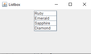
      <listbox">
         <listitem label="Ruby"/>
         <listitem label="Emerald"/>
         <listitem label="Sapphire" selected="true"/>
         <listitem label="Diamond"/>
      </listbox>
The result is:
tree
Main Article: XUL tree
The
tree element describes a table with one or more columns. Contrary to the listbox elemnt, the cells can be edited. Note that contrary to the original XUL specification, the tree element can not represent hierarchical trees.The listbox has several children elements:
- The
treecolselement describes the header of atree - The
treecolelement describes ont column of the tree - The
treechildrenelement describes the content of the tree - The
treeitemandtreerowelements describes one row - The
treecellelement describes one cell
-
id: the id of the element -
hidden: true if the element is hidden -
disabled: true if the element is disabled -
editable: true if the element is editable -
selectedIndex: the index of the currently selected row -
editingColumn: the editing column -
editingRow: the editing row -
top: the element position from its parent top corner. Only used if the parent is astackelement -
left: the element position from its parent left corner. Only used if the parent is astackelement -
width: the element width -
height: the element height -
view: return a view of the tree allowing to get or set the characteristics of cells -
class: the CSS style class of the element -
style: the CSS style of the element -
onselect: the Javascript function to execute if the user select a row -
onchange: the Javascript function to execute if the user modifies a cell
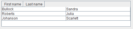
      <tree>
         <treecols>
            <treecol label="First" />
            <treecol label="Last" />
         </treecols>
         <treechildren>
            <treeitem>
               <treerow>
                  <treecell label="Sandra" />
                  <treecell label="Bullock" />
               </treerow>
            </treeitem>
         </treechildren>
      </tree>
Result:
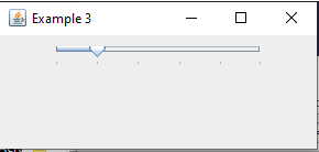
scale
Thescale element describes a slider.The possible attributes are:
-
id: the id of the element -
hidden: true if the element is hidden -
disabled: true if the element is disabled -
value: the current value fo the slider -
max: the maximum value -
min: the minimum value -
pageincrement: the major increment value -
increment: the minor increment value -
top: the element position from its parent top corner. Only used if the parent is astackelement -
left: the element position from its parent left corner. Only used if the parent is astackelement -
width: the element width -
height: the element height -
class: the CSS style class of the element -
style: the CSS style of the element -
oncommand: the Javascript function to execute if the user change the value -
onchange: the Javascript function to execute if the user change the value -
onmouseoverfor mouse over events -
onmouseoutfor mouse exit events
<scale width="200" max="100" value="20" pageincrement="20" />The result is:
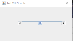
scrollbar
Thescrollbar element describes a scrollbar.The possible attributes are:
-
id: the id of the element -
hidden: true if the element is hidden -
disabled: true if the element is disabled -
maxpos: the maximum position of the thumb -
curpos: the current position of the thumb -
pageincrement: the major increment value -
increment: the minor increment value -
top: the element position from its parent top corner. Only used if the parent is astackelement -
left: the element position from its parent left corner. Only used if the parent is astackelement -
width: the element width -
height: the element height -
oncommand: the Javascript function to execute if the user change the value -
onchange: the Javascript function to execute if the user change the value -
onmouseoverfor mouse over events -
onmouseoutfor mouse exit events
      <stack>
         <scrollbar curpos="10" maxpos="200" width="200" top="50" left="50"/>
      </stack>
The result is:
image
Theimage element describes an image.The possible attributes are:
-
id: the id of the element -
hidden: true if the element is hidden -
image: the image -
top: the element position from its parent top corner. Only used if the parent is astackelement -
left: the element position from its parent left corner. Only used if the parent is astackelement -
width: the element width -
height: the element height -
onmouseoverfor mouse over events -
onmouseoutfor mouse exit events
Example:
<image src="hellfire.jpg" width="50" height="50" />
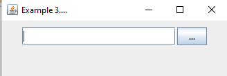
filefield
Thefilefield element describes a file selector. It is composed by a text field which shows the current path of the selected file, and button to open a file chooser.The possible attributes are:
-
id: the id of the element -
hidden: true if the element is hidden -
disabled: true if the element is disabled -
cols: the number of columns of the selected path -
type: the type of the selectable files, which can be: - "all" (the default): the user can select files or directories
- "file: the user can select files only
- "directory": the user can select directories only
-
dialogtype: the type of the file selector, which can be: - "open" (the default): the file selector allows to select files to open
- "save": the file selector allows to select files to save
-
title: the title of the file chooser which will popup to select the file -
extensions: the file extensions which may filter the files to show and select. You can specify more than one extension by separating them with commas[3]For example "xul, xml" is a valid value for the extensions -
top: the element position from its parent top corner. Only used if the parent is astackelement -
left: the element position from its parent left corner. Only used if the parent is astackelement -
class: the CSS style class of the element -
style: the CSS style of the element -
oncommand: the Javascript function to execute if the user select a file -
onchange: the Javascript function to execute if the user select a file -
onmouseoverfor mouse over events -
onmouseoutfor mouse exit events
<filefield extensions="xul" type="file" cols="20" />The result is:
tab
Thetab element specifies one tab under a tabbox element. Note that this element must be under a
tabs element.Example:
      <tabbox id="myTabList" selectedIndex="2">
         <tabs>
            <tab label="A First tab"/>
            <tab label="Another tab"/>
            <tab label="Last tab"/>
         </tabs>
         <tabpanels>
      ...
         </tabpanels>
      </tabbox>
menuitem
Themenuitem element displays an item in a menulist or a menu.The possible attributes are:
-
id: the id of the element -
label: the label of the item -
disabled: true if the element is disabled -
class: the CSS style class of the element -
style: the CSS style of the element -
oncommand: the Javascript function to execute if the user select the item -
onchange: the Javascript function to execute if the user select the item -
onmouseoverfor mouse over events -
onmouseoutfor mouse exit events
- Be under a
menupopupelement
      <menu>
         <menupopup>
            <menuitem label="Red"/>
            <menuitem label="Blue"/>
            <menuitem label="Yellow"/>
         </menupopup>
      </menu>
The result is:
menuseparator
Themenuseparator element displays a separator in a menu. This element has no attribute.Note that this element must be under a
menupopup element.Example:
      <menu>
         <menupopup>
            <menuitem label="Red"/>
            <menuitem label="Blue"/>
            <menuseparator/>
            <menuitem label="Yellow"/>
         </menupopup>
      </menu>
The result is:
Utility elements
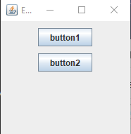
spacer
Thespacer element is an invisible element setting a specified space between two controls.The possible attributes are:
-
id: the id of the element -
width: the width gap -
height: the height gap
      <vbox>
         <button label="button1" />
         <spacer height="10px" />
         <button label="button2" />
      </vbox>
The result is:
toolbarspacer
Thetoolbarspacer element is an invisible element setting a specified space between two controls in a toolbar.The possible attributes are:
-
id: the id of the element -
width: the width gap
      <toolbar id="nav-toolbar">
         <toolbarbutton id="nav-users"  label="Users"/>
         <toolbarbutton id="nav-groups" label="Groups"/>
         <toolbarspacer width="5px"/>
         <toolbarbutton id="nav-events" label="Events"/>
      </toolbar>
caption
Thecaption element is used to set a label for the parent element.The possible attributes are:
-
id: the id of the element -
label: the label of the caption
      <groupbox>
         <caption label="Answer"/>
         <description value="Banana"/>
         <description value="Tangerine"/>
         <description value="Kiwi"/>
      </groupbox>
Notes
See also
- XUL controls overview: This article presents an overview of XUL controls
- XUL events management: This article explains the management of XUL events
×
![]()
Categories: builtin-applis